Guide · November 2026
How the site and the Studio work
Everything you can do with the site, in the order you'll do it: adding work, shaping each collection's page, animating with video and frame sequences, selling prints, and editing the front page visually.
01
Signing in and finding your way around
Open https://ivansamur.com/studio and enter the password. The first-time password is ivan — change it straight away under Password in the sidebar. You stay signed in for two weeks on that device.
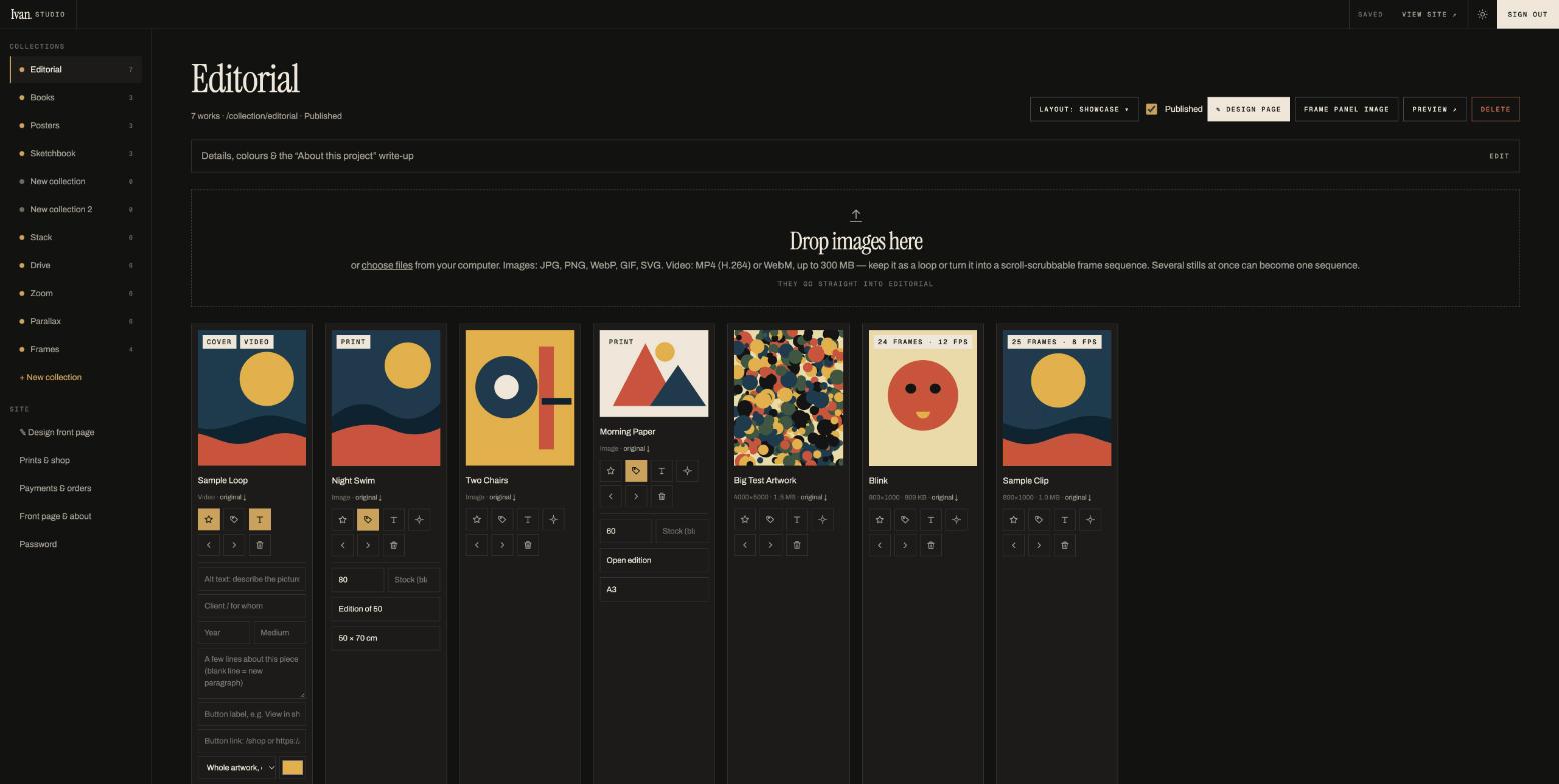
The sidebar
- Collections — one entry per collection. A gold dot means published (visible on the site); a grey dot means draft (only you see it). The number is how many works it holds.
- + New collection — opens the template gallery (section 02).
- ✎ Design front page — the front page in a live preview you can click on (section 08).
- Prints & shop — everything tagged as a print, with prices and stock.
- Payments & orders — Stripe set-up and the list of orders (section 10).
- Front page & about — your name, tagline, first-panel artwork, bio, newsletter text, email and social links (section 11).
- Password — change it here.
The top bar
Saved / Saving… shows the autosave state. View site ↗ opens the public site in a new tab. The sun/moon switch previews Night and Day mode. Sign out ends the session on this device.
02
Collections: creating one and choosing its page template
A collection is a group of works with its own page on the site and its own full-screen panel on the front page — Editorial, Books, Posters, and so on.
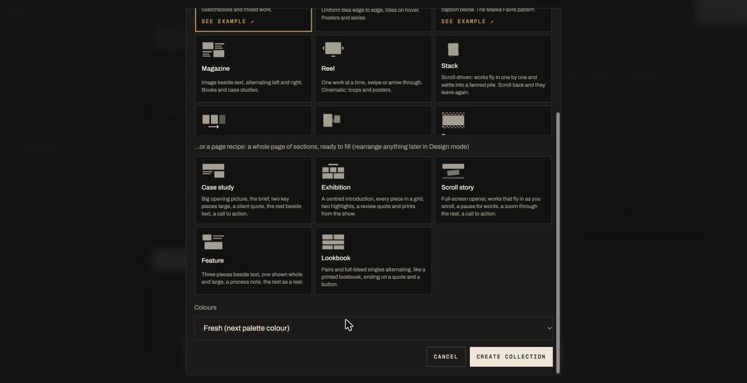
- + New collection in the sidebar.
- Type the name (it becomes the panel title and the page address, e.g.
/collection/murals). - Pick a page template (section 03) or a page recipe (section 07). The See example ↗ link under a card opens a live page that uses it. You can change your mind any time later: the Layout menu and Design mode both offer the same choices.
- Choose colours: a fresh palette colour, or copy the colours and eyebrow from an existing collection so a family of pages matches.
- Create collection. It starts as a draft: drop images in, write the blurb, then tick Published.
The collection header
Click the big title to rename. Layout ▾ changes the template. Published shows or hides the collection. ✎ Design page opens Design mode. Frame panel image positions the cover inside the front-page panel. Preview ↗ opens the page. Delete removes the collection (its works stay in the library until you delete them individually).
Details, colours & the write-up
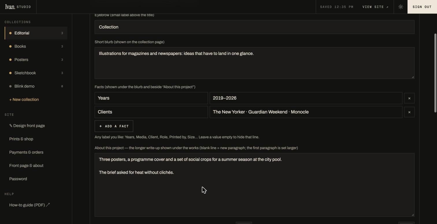
Open the Details… box under the header to set the eyebrow (the small label above the title, e.g. "Collection" or "Personal"), the short blurb for the page header, the facts, the two panel colours, and the longer About this project text (section 06).
03
The ten page templates
Each collection page shows its works in one of these layouts. The first five are classic; the last five are scroll-driven: the page pins and your scrolling plays the animation, forwards and backwards.
| Template | What the visitor sees | Good for |
|---|---|---|
| Wall | Masonry grid in the works' own proportions; click opens the viewer. | Sketchbooks, mixed work |
| Grid | Uniform 4:5 tiles edge to edge, titles on hover (uses each work's focal point for the crop). | Posters, series |
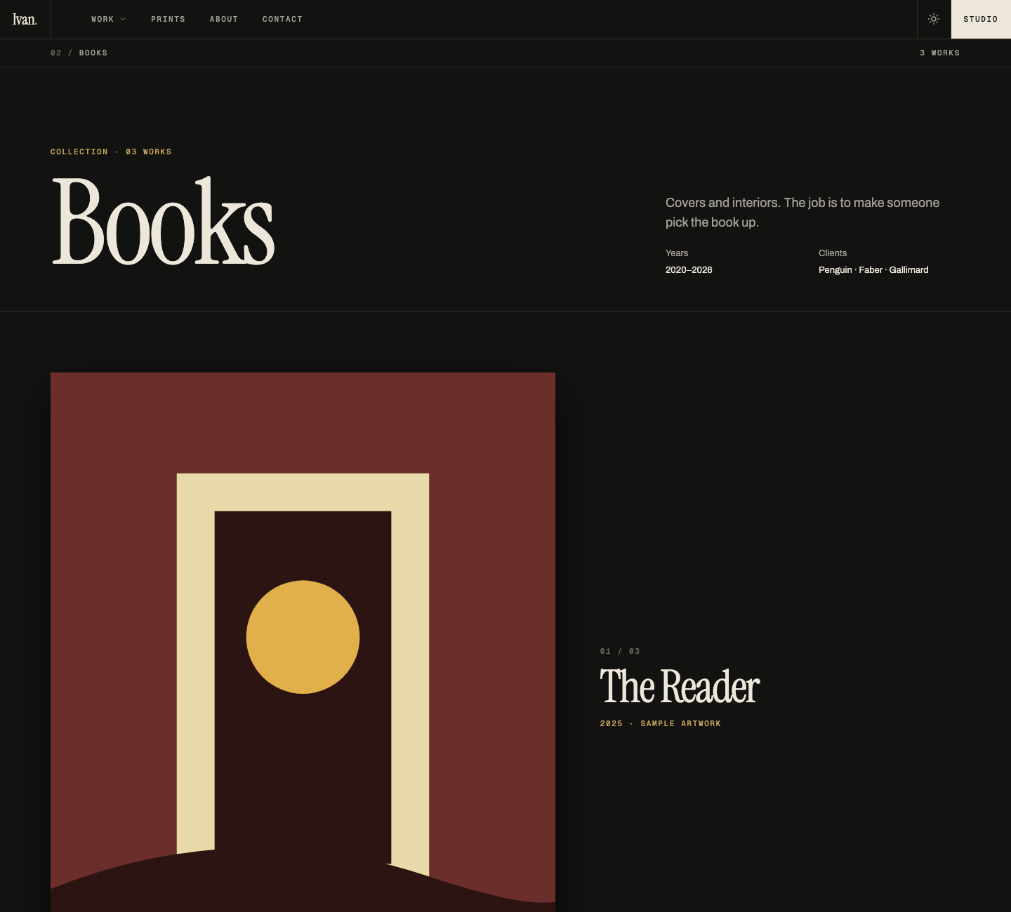
| Showcase | One full-width box per work with a centred caption and an optional button. Video and frame loops play in place. | Big single pieces, the Malika Favre look |
| Magazine | Image beside text, alternating left and right down the page. | Books, case studies |
| Reel | One work at a time; swipe, arrows or ← → keys. | Loops, posters |
| Stack | Pinned: works fly in one by one and settle into a fanned pile. Each can be placed and sized by hand. | Any set of 4–8 pieces |
| Drive | Pinned: vertical scrolling moves a horizontal row sideways, captions riding along. | Sequences, panoramas; needs 5+ works |
| Zoom | Pinned: works start small and scattered, grow toward you and pass by. Each can be placed and sized by hand. | Playful sets, teasers |
| Parallax | Not pinned: works of mixed sizes move at different speeds and overlap. | Long collections |
| Frames | Pinned per frame sequence: the scrollbar scrubs the animation frame by frame. Other works show as boxes. | Blinks, loops, anything made of frames |
04
Adding work: images, videos, frame sequences
Open a collection and drag files anywhere onto the page (or click the drop zone to choose files). Each file uploads with a progress bar and appears as a card at once. Whatever you upload is kept untouched as the original; visitors receive resized copies made automatically for their screen, so upload your full-size files.
Images
JPG, PNG, WebP, GIF, SVG, AVIF — up to 300 MB each. Animated GIFs keep animating. The card shows the pixel size and file size and has an original ↓ link to download the file you uploaded.
Videos
Drop an MP4 (H.264) or WebM, ideally 2–10 seconds. A dialog asks what to do with it:
- Video loop — plays silently and loops wherever it appears; a still frame is captured automatically for thumbnails. Visitors on phones get a play button only if their phone blocks autoplay (Low Power Mode).
- Frames · 8 / 12 / 24 fps — the Studio extracts frames from the clip and makes a frame sequence (below). The original clip is kept too.
Frame sequences
A frame sequence is an animation stored as numbered stills. On most pages it plays as a loop, like a sharp GIF; in the Frames template (or a Frames section) the scrollbar scrubs it: scroll down and the face blinks, scroll up and it un-blinks.
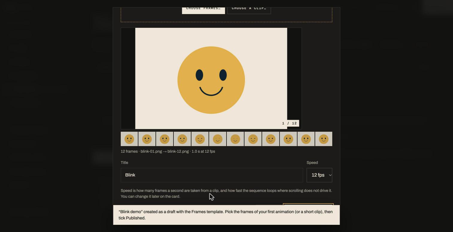
The easy way: create the collection with the Frames template (or switch an existing one to it). The Studio immediately asks for your frames in the frames window: drop the numbered stills of one animation (blink-01.png, blink-02.png, …) or one short clip, or use Choose frames… / Choose a clip…. Move the mouse across the strip or the big preview to check the order (it follows the file names), set the title and the Speed (8 / 12 / 24 fps), press Upload. Dropping files anywhere on a Frames collection opens the same window, as does + Add a frame sequence under its drop box.
In any other collection there are still two ways:
- From a clip: drop the video and choose Frames. 12 fps on a 3-second clip gives 36 frames, which scrubs smoothly.
- From stills: select the numbered images and drop them together — when four or more arrive at once the Studio asks Separate works or One frame sequence — or click Make a frame sequence under the drop zone.
The card shows "36 frames · 12 fps"; move the mouse across its thumbnail to scrub through the frames. + frames on the card opens the window again to add more stills to the end. fps (also in the T caption box) sets how fast it loops on non-scrubbing pages. Keep every frame the same size.
/samples/blink-frames.zip (24 frames of a face blinking) and /samples/sunrise-frames.zip (36 frames, a sun rising through a colour shift). Unzip, select all the PNGs, drop them into the frames window.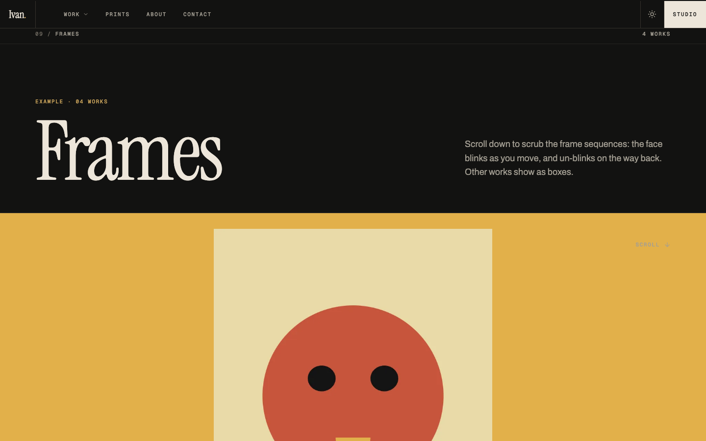
05
Every button on a work's card
Each uploaded work is a card. The title is editable in place — click it and type. Below the title:
Badges on the thumbnail tell you at a glance: Cover Print Video 24 frames · 12 fps.
06
Writing: blurbs, "About this project", captions
Three places take text, each with a different job:
| Where | What it is | Shows up |
|---|---|---|
| Short blurb Collection → Details | One or two sentences introducing the collection. | Collection page header, beside the big title |
| About this project Collection → Details | The long write-up: what the project was, who it was for, how it was made. A blank line starts a new paragraph; the first paragraph is set larger. | Under the works on the collection page, with the collection's facts (Years, Media, Client… whatever you set) beside it |
| Caption Work card → T | Per work: client, year, medium, text, and a button (label + link, e.g. "View in shop" → /shop). | Showcase, Magazine, Reel and Drive layouts, and the viewer |
Links can be site addresses (/shop, /collection/books) or full web addresses (https://…, which open in a new tab).
07
Design mode: building the page from sections
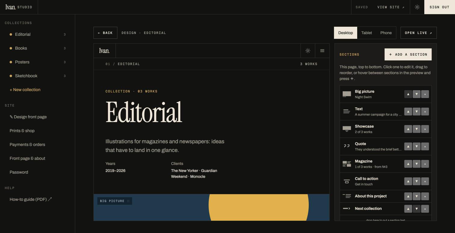
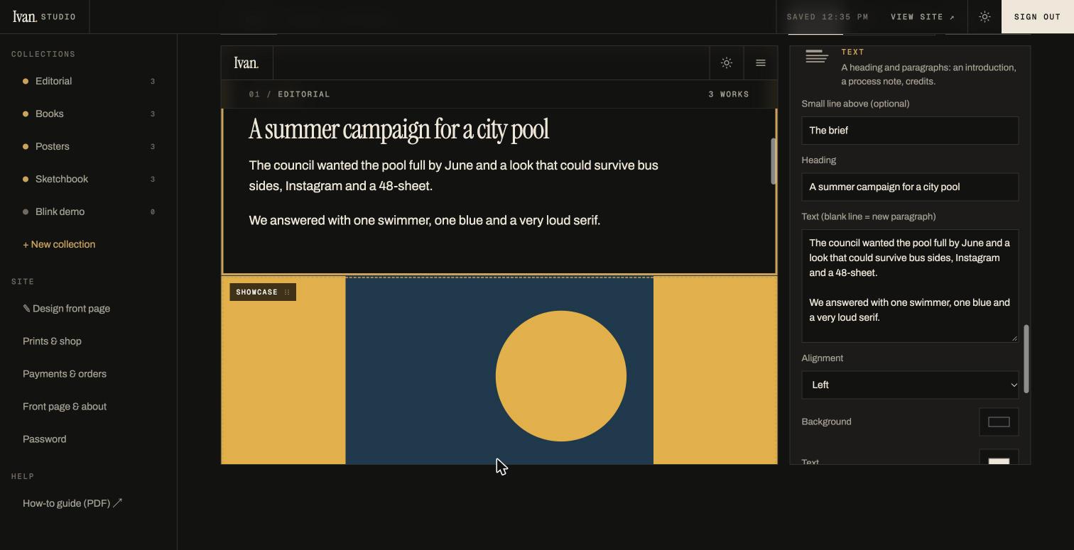
Press ✎ Design page on any collection (or ✎ Design front page in the sidebar). The real page appears in a live preview with a panel beside it. Click anything in the preview to select it; change a field in the panel and the preview updates at once. Everything autosaves — there is no Save button.
A page is a list of sections
Every page is built from sections stacked top to bottom. A new collection starts with three — its template over all its works, About this project, Next collection — and the front page with four. The list at the top of the panel is the page; whatever you do there happens in the preview.
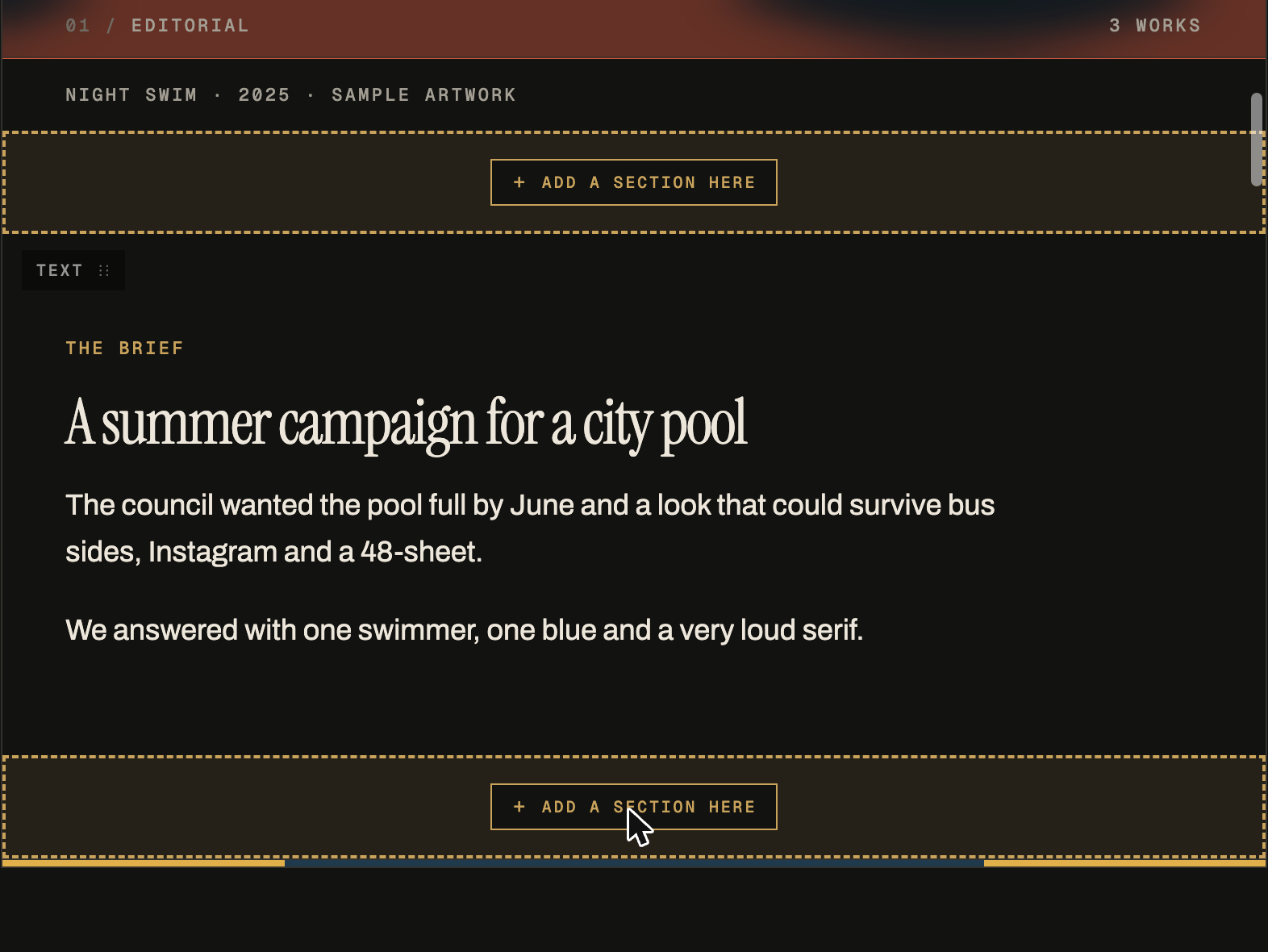
- Add: + Add a section opens the section library. Click a card to add it at the end of the page, or drag the card into the preview: drop zones appear between the sections and you let go where you want it. Hover between two sections in the preview and a + Add a section here line appears; pressing it opens the library for that exact spot.
- Edit: click a section in the list, or its small label in the preview, and the panel shows only what that section needs: which works, a heading and text, a quote, a button, colours. New sections arrive already filled (the cover work, a sample line), so the page always looks right — you change words rather than fill in forms.
- Arrange: ▲ ▼ in the list, or drag a row; the section's label in the preview can be dragged onto a drop zone too.
- Remove: ×. A small Undo appears for a few seconds.
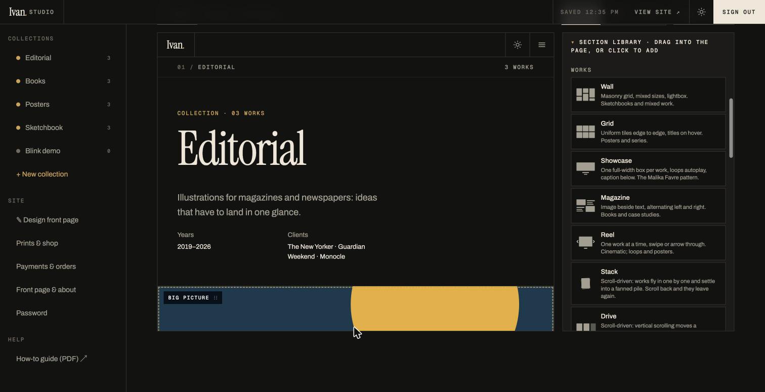
The sections you can use
| Section | What it does | Its settings |
|---|---|---|
| Wall, Grid, Showcase, Magazine, Reel, Stack, Drive, Zoom, Parallax, Frames Works | The ten layouts from section 03, each over a chosen set of works. One page can mix them: a Showcase of three key pieces, then a Grid of the rest, then a Frames sequence. | All works, or tick the ones you want. By position ("start from work № / at most") for "the first two" or "the rest". On the front page: which collection. |
| Big picture Works | One work, full width — a hero image, a video loop or a sequence. | The work; filling the box (crops) or whole, on a colour; full screen or natural height; title under it on/off; colours. |
| Two up Works | Two works side by side with their titles. | Tick two works. |
| Text Words | A heading and paragraphs: an introduction, the brief, a process note, credits. | Small line above, heading, text, left / centred, background and text colours. |
| Quote Words | A big pull quote with who said it. | Quote, attribution, colours. |
| Call to action Words | A line and a button: "Commission a piece", "See the prints", "Get in touch". | Small line above, line, button label, button link (#contact, /shop or a full address), colours. |
| About this project Page | The collection's write-up with its facts beside it. | The write-up and the facts, edited right here. |
| Next collection Page | The big link to the next published collection. | Automatic. |
| Shop Page | A strip of prints with prices and a link to the shop. | Small line, heading, how many prints. |
| About & newsletter Page | Your bio beside the newsletter sign-up. | Bio and newsletter line, edited right here. |
| Opening panel, Collection panels Front page only | The full-screen panel with your name, and one panel per collection. | Name, line, link, artwork, colours, Frame image; the panel order. |
Page recipes
A page recipe is a whole page of sections, ready to fill. Pick one when you create a collection, from the Layout ▾ menu, or from Start again from a template or a page recipe at the bottom of the Sections panel — then move, add or remove anything. Recipes describe works by position ("the first two", "the rest", "the third one"), so the same recipe fits any collection.
| Recipe | What you get, top to bottom | Good for |
|---|---|---|
| Case study | Big picture → Text (the brief) → Showcase of the first two → Quote → Magazine of the rest → Call to action → About this project → Next | Client work with a story |
| Exhibition | Centred Text → Grid of everything → Two up → Quote → Shop strip → Next | A show, a series |
| Scroll story | Big picture → Stack of six → centred Text → Zoom through the rest → Call to action → Next | Energy; portfolio highlights |
| Feature | Magazine of three → Big picture shown whole → Text (process) → Reel of the rest → About this project → Next | Book covers, editorial |
| Lookbook | Two up → Big picture → Two up → Wall → Quote → Call to action → Next | Posters, prints |
The collections named Recipe · Case study, Recipe · Exhibition and so on show each recipe built from sample work; delete them when you no longer need the examples.
What else the panel offers
- Collection — name, eyebrow, blurb, colours, published.
- Selected work (click a work in the preview) — title, alt text, caption fields, box fit and colour, make cover, tag as print, focal point, move earlier/later, delete.
- Placement (Stack and Zoom only) — Left·right, Up·down, Size and, for Stack, Tilt. Or simply drag the work in the preview to where you want it; the position is saved. Reset placement returns it to the automatic spot.
Use Desktop / Tablet / Phone to check the page at each size before you publish. Open live ↗ shows the real page; ← Back returns to the collection.
08
The front page: panels, framing, order
The front page is a stack of full-screen panels: the first is you (name, tagline, your chosen artwork), then one panel per published collection, then the shop row, about and newsletter, and the footer with your email. It is built from sections too: ✎ Design front page lists Opening panel, Collection panels, Shop and About & newsletter, and you can reorder them or add a Grid or Showcase of any collection, a Big picture, a Text or a Call to action between them. Back to the standard front page restores the original order.
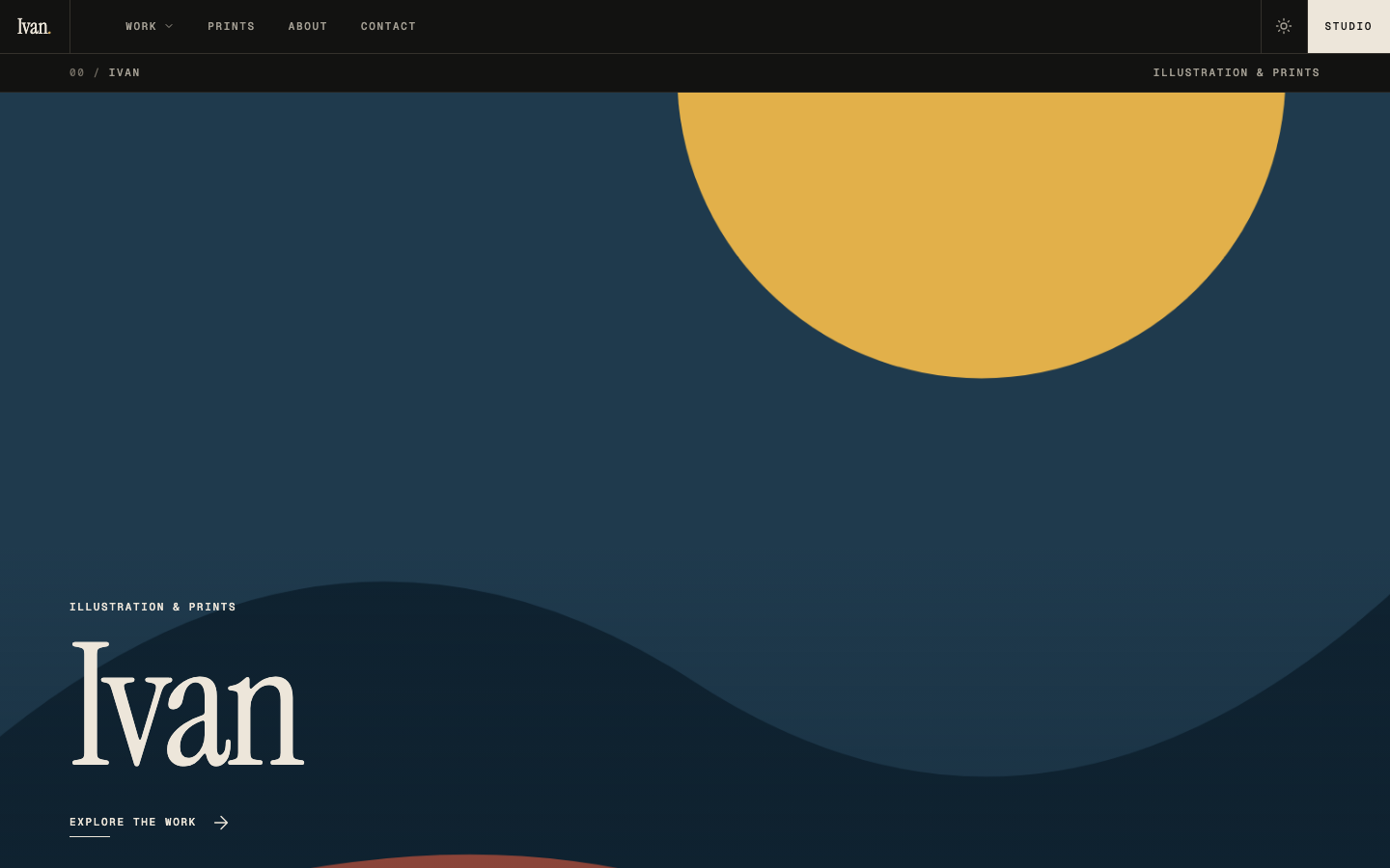
✎ Design front page in the sidebar opens the same builder for the front page. Its sections are Opening panel, Collection panels, Shop and About & newsletter; add a Grid or Showcase of any collection, a Big picture, a Text or a Call to action between them, reorder, or press Back to the standard front page. Click a panel in the preview to edit it:
- Opening panel — name, small line, link text, background and text colours, the artwork (click a thumbnail), and Frame image.
- Collection panel — name, eyebrow, colours, cover (click a thumbnail), published, Frame image, and a shortcut to that collection's page design.
- Panel order — select the Collection panels section for the up/down arrows; this is also the order in the Work menu.
Frame image
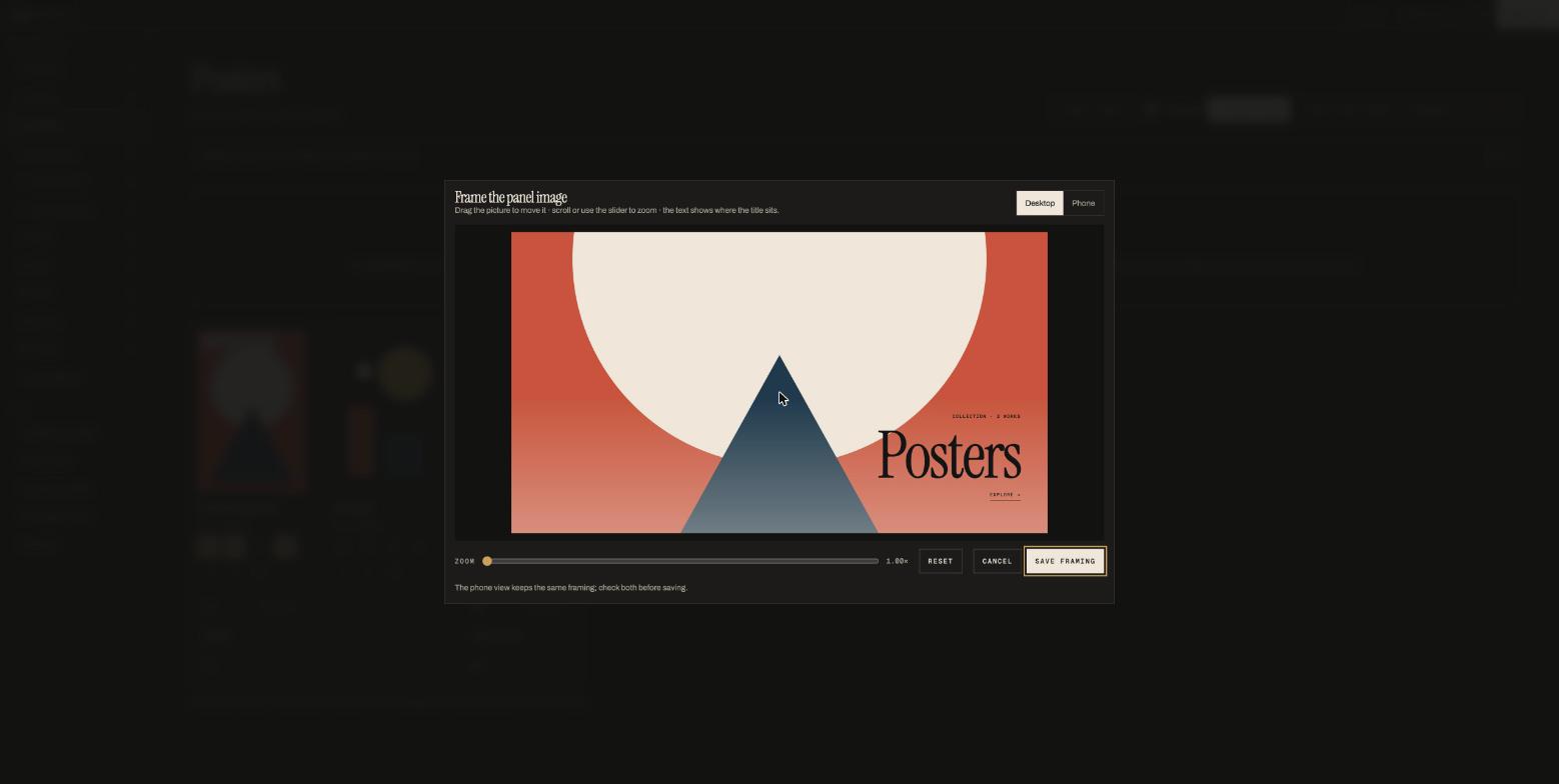
The panel slowly breathes and tilts with the cursor on the live site; the framing you save is the resting position.
09
Focal points and framing: controlling the crop
Two tools decide what shows when a picture has to be cropped:
- Frame image (previous section) is for the front-page panels: you pan and zoom the whole panel.
- Focal point (⌖ on a work's card, or in Design mode) is for everywhere else a work is cropped: Grid tiles, the thumbnails in the Work menu, "fill the screen" boxes, and frame sequences in cover mode. You mark one spot that must stay visible; the crop is arranged around it.
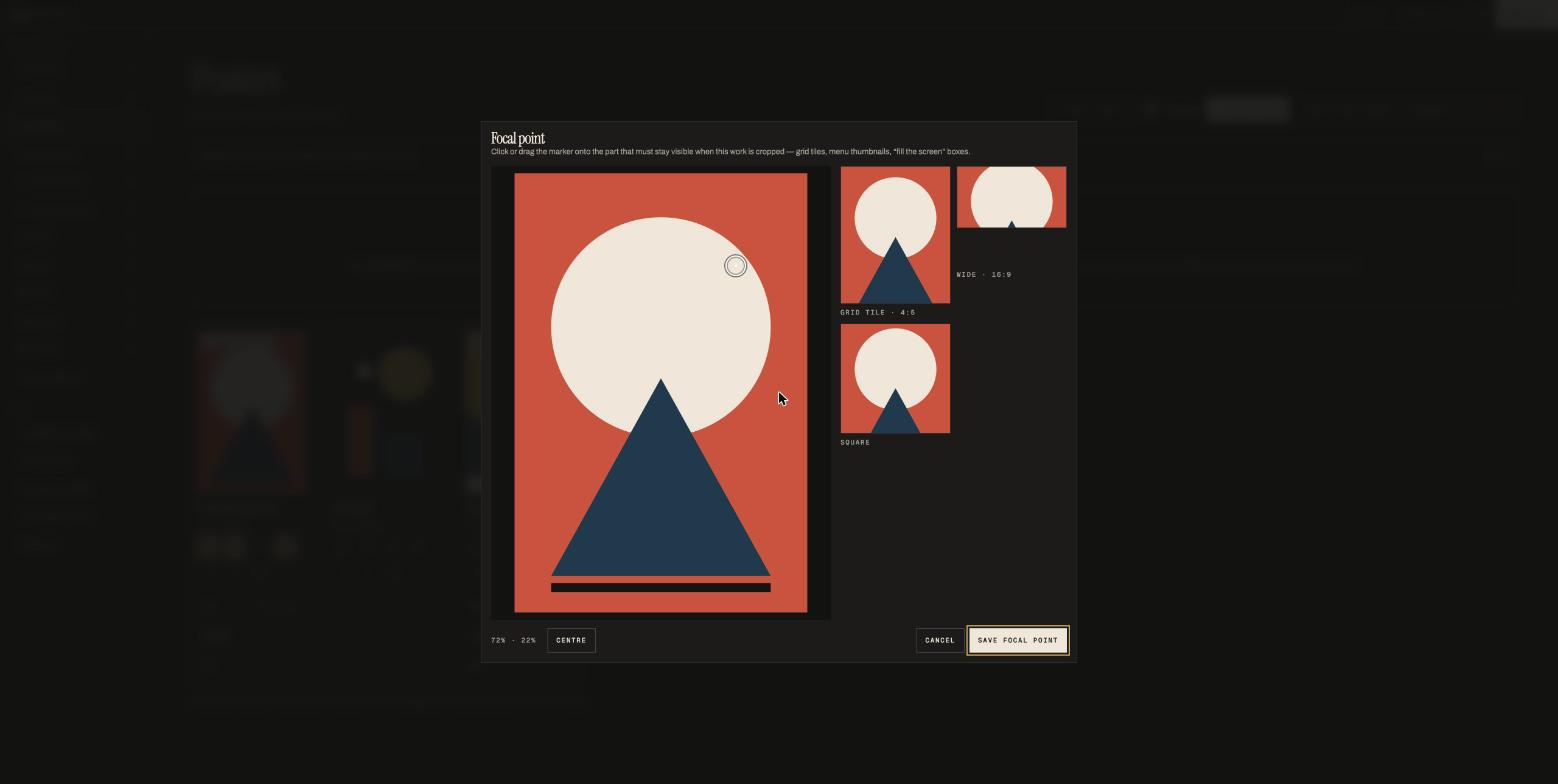
Layouts that show the whole picture (Wall, Magazine, Reel, Stack, Zoom, Parallax, the viewer) ignore the focal point — nothing is cropped there.
10
Prints and payments with Stripe
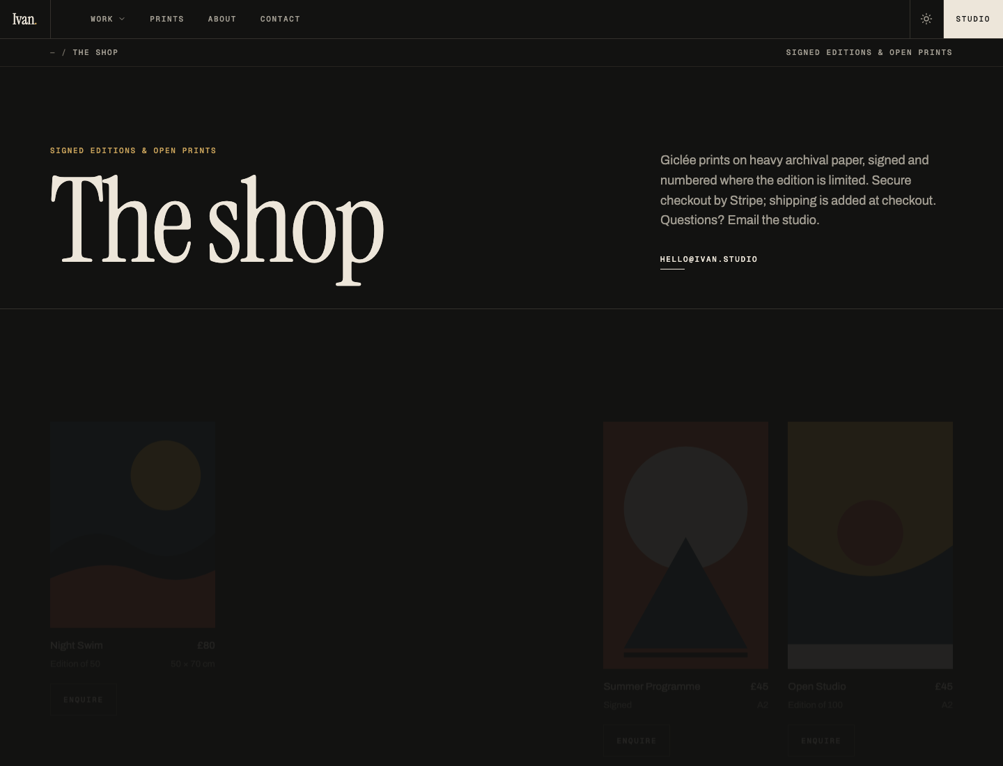
Tag any work as a print with 🏷 on its card and fill in price, stock (leave blank for an open edition; a number counts down with each sale and shows "Sold out" at zero), edition text and size. Prints appear in the shop and, the first four, on the front page. Prints & shop in the sidebar lists them all for reordering.
Switching payments on
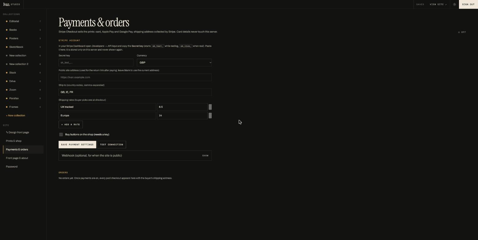
- In your Stripe Dashboard open Developers → API keys and copy the Secret key. While trying things out use the test key (starts
sk_test_); for real sales use the live key (sk_live_). - In Payments & orders paste the key, choose the currency, list the countries you ship to (two-letter codes: GB, IE, FR …) and add flat shipping rates — the buyer picks one at checkout.
- Save payment settings, then Test connection to confirm the account and mode.
- Tick Buy buttons on the shop and save again. Each print now has Buy · £80 instead of Enquire.
How a sale works
The buyer presses Buy and goes to Stripe's payment page (card, Apple Pay, Google Pay; Stripe collects the shipping address). Afterwards they land on your thank-you page; the order is recorded, stock reduced, and Stripe emails them a receipt. The order appears under Orders with name, email and address; set its status to shipped when it's gone. In test mode, pay with card 4242 4242 4242 4242, any future date, any CVC.
11
Front page & about settings, newsletter, contact
Front page & about in the sidebar holds the words and pictures that aren't tied to one collection:
- Name (the big title on the first panel), the small line above it, the link text, the panel colours, the artwork (pick any uploaded work) and Frame first panel image.
- Site opens in Night or Day mode. Visitors can switch with the sun/moon in the bar; the panels keep their own colours in both.
- About — two or three sentences; Newsletter blurb — the line beside the sign-up field.
- Email (shown large in the footer and used by the shop), location, Instagram and Behance links (leave blank to hide).
Newsletter sign-ups are saved on the server (Daniel can export them); a proper newsletter tool can be connected later.
12
Good files: sizes, formats, exporting clips and frames
| For | Recommended |
|---|---|
| Images | Full-size JPG or PNG straight from your export — 3000–6000 px on the long side is ideal. The server keeps the original and makes 480–2800 px copies for visitors, so there is no need to resize first. |
| Transparent artwork | PNG or WebP with transparency; the box colour behind it is set per work (T caption) or per collection. |
| Animated GIF | Fine as it is; it animates on the site. For anything over a few MB prefer a video or frame sequence. |
| Video loop | MP4 (H.264) or WebM, 2–10 s, 1080p or 4K, no sound needed. Export normally from After Effects / Premiere / iPhone; raw screen recordings sometimes lack duration information and can't be turned into frames. |
| Frame sequence from stills | Numbered files in order (name-01.png …), all the same size, 24–72 frames. PNG or JPG. |
| Frame sequence from a clip | Choose 12 fps for most things, 24 for fast motion, 8 for a slow blink. Up to 240 frames. |
13
Troubleshooting and housekeeping
"Your session ended. Sign in again."
Sessions last two weeks per device. Sign in; nothing is lost — unsaved edits are kept in the tab and sent after you sign in.
A video needs a tap to play on iPad or iPhone
The device is refusing unattended playback: check Settings → Battery → Low Power Mode (off) and Settings → Safari → Auto-Play (not "Never"). The site starts loops on the first touch regardless.
A new image looks blurry for a second
Resized copies are made in the background right after upload; the first viewer may briefly see a smaller one. It settles within moments.
The Studio in two tabs shows different things
Switch back to a tab and it refreshes itself. Saves from different tabs merge; you cannot overwrite your own work from another device.
Deleting
Deleting a work removes its file from the server too; deleting a collection leaves its works in the library. Both ask for confirmation. There is no undo, so download the original ↓ first if in doubt.
Where everything lives
On the NAS: /Volume2/ivan-site/uploads holds every original you've uploaded (your archive), data/site.json holds all the text and settings, data/orders.json the orders. Back these up.